By Jermaine Thomas May 30, 2025
In catering, food is not just nourishment. It is also a visual experience. Before a guest takes their first bite, they see the dish, and that first impression can shape how the food is perceived and enjoyed. This is where visual design becomes essential. Chefs do more than cook. They curate a visual story on every plate or buffet table.
The fundamentals of food colour balance, contrast, and composition are essential for producing dishes that look elegant and professional in addition to tasting delicious. The visual appeal of food can improve the ambiance of an event and create a lasting impression on guests, whether it is serving a small dinner or catering a wedding for hundreds.
Color: Creating Harmony and Appetite
Color is the first thing we notice about food. It influences how fresh or flavorful something appears and can even change how we think it will taste. That is why food color balance is at the heart of presentation. Chefs use color to create harmony, contrast, or emphasis in a dish.
Balanced color does not mean using every hue on the plate. It means choosing colors that complement each other and reflect the ingredients naturally. Bright greens from herbs or vegetables can liven up an otherwise neutral protein. Vibrant orange from roasted carrots or mango can warm up a salad or dessert plate. Cool purples and deep reds from beets or berries bring richness and depth.
Chefs often use the color wheel, similar to visual artists. They pair complementary colors, like green and red or yellow and purple, to make a dish pop. A vivid red tomato sauce served beside a rich green pesto is an example of this contrast in action.
Using seasonal produce in catering presentation tips keeps the palette fresh. Light greens, yellows, and gentle reds are frequently used in springtime recipes. Deeper colours like amber, burgundy, and brown are incorporated into autumnal dishes. The theme of the event is also reflected in colour. While blush, citrus, and mint are more appropriate for a summer brunch, ivory, sage, and dark chocolate may be preferred for a winter wedding.
Color also connects to flavor and emotion. Warm tones tend to suggest comfort and heartiness, while cool colors feel fresh and cleansing. Chefs carefully consider these associations when choosing their ingredients and plating styles.
Contrast: Visual Drama That Engages
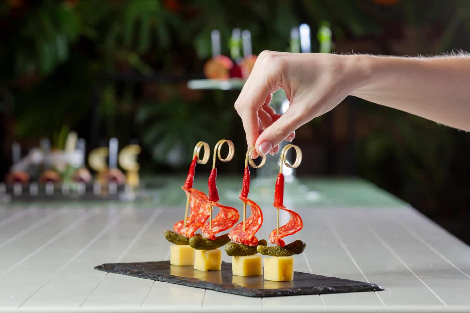
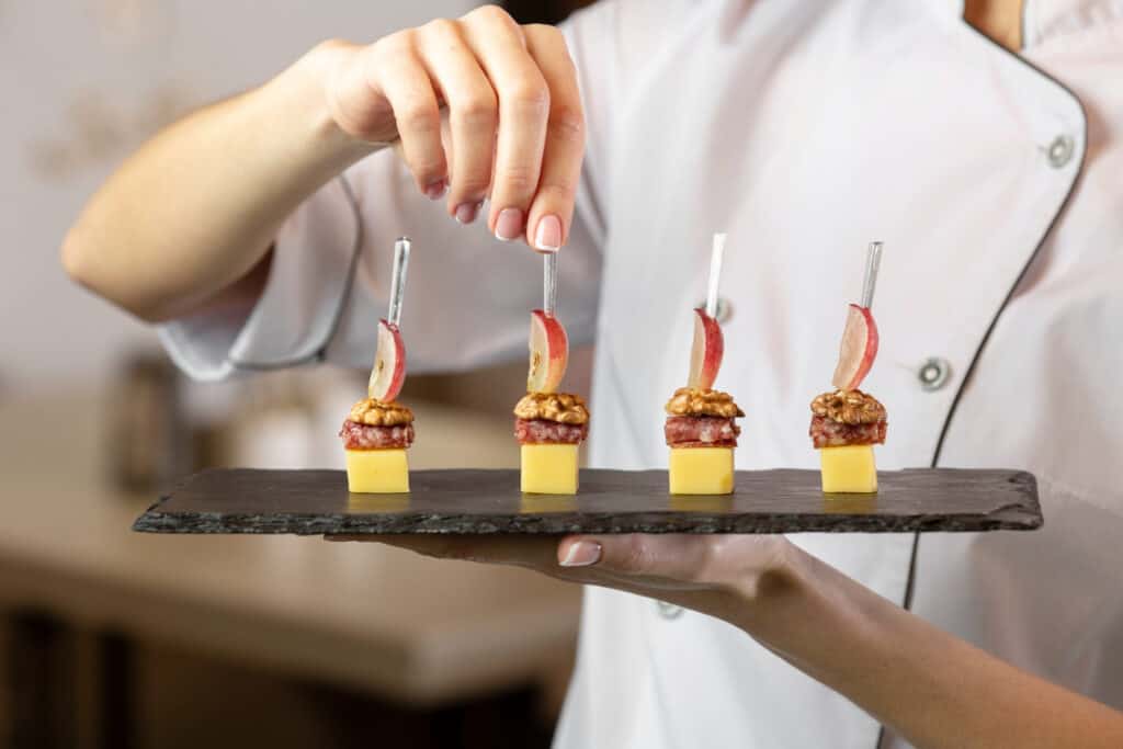
If color sets the mood, contrast creates excitement. Visual contrast can come from differences in shape, size, texture, or temperature. A creamy soup with a crispy garnish or a round chocolate truffle on a square ceramic plate immediately grabs attention. The eye is drawn to difference, and that is what makes a presentation feel dynamic.
Contrast is crucial when it comes to meal composition art. A plate with only gentle textures or a monochromatic colour scheme may appear uninteresting and flat. Chefs steer clear of this by combining firm, juicy, smooth, and crunchy ingredients. A classic illustration of balanced contrast is a bed of smooth mashed potatoes beneath a charred steak, garnished with green microgreens and crispy onions.
Contrast also applies to vertical height. A flat plate can look uninspired, while a dish with varied levels feels more architectural and thoughtful. Stacking, layering, and arranging food with thoughtful spacing helps the composition feel alive rather than static. Chefs often use color contrast as well. A pale dish like cauliflower puree is offset by bright herbs or beet glaze. White plates help dark sauces stand out, while black or slate plates are popular for light-colored foods like fish or dessert.
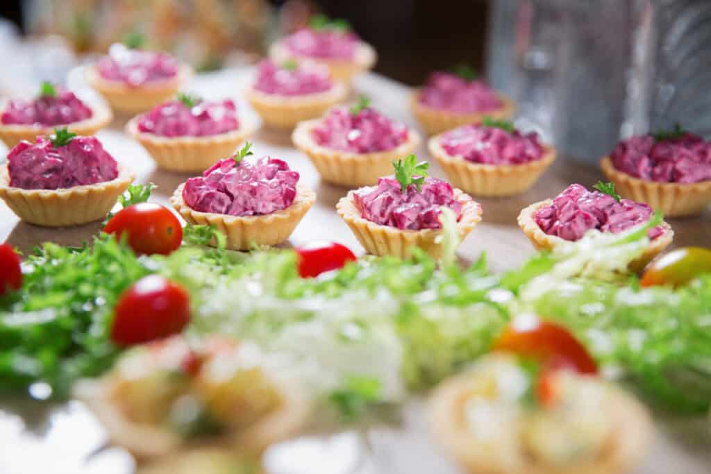
In buffet catering, where large trays are used, contrast is created with layering and alternating colors. Rows of sushi rolls with different toppings or a dessert table with various heights and finishes add visual rhythm.
Composition: Artful Arrangement of Every Element
Composition is the art of placing elements in a way that feels intentional and pleasing. It draws from the same principles as photography or painting: balance, symmetry, negative space, and focal points. For chefs, this is where the meal truly becomes a canvas.
In meal composition art, the arrangement of food on the plate should guide the eye. A focal point, such as a seared piece of meat or a decorated dessert, anchors the composition. Supporting elements are placed around it to enhance its appeal without overcrowding.
Both symmetrical and asymmetrical balance are possible. In fine dining, symmetrical plating is frequently used to convey a sense of formality and control. Asymmetrical designs, where elements are positioned off-center or diagonally to create movement, feel more contemporary and artistic. The rule of thirds is frequently adhered to by chefs. They arrange the focal item at an intersection point and divide the plate into thirds rather than putting everything in the centre. This method avoids static arrangements and naturally attracts the eye.
Negative space, or empty space, is another powerful tool. Leaving room on the plate allows the dish to breathe. It prevents clutter and helps highlight the main components. This is especially important in catering presentation tips for large events, where clarity and cleanliness create a sense of professionalism.
In buffet and grazing tables, composition involves the layout of the entire table. Items are grouped by type or color, with visual cues that help guests navigate the offerings. Boards may feature flowing lines of cheese, fruit, and crackers that lead the eye from one end to the other.
Telling a Story Through Visuals
Food tells a story, and visual design helps communicate that narrative. Whether the meal is rustic, elegant, playful, or exotic, the presentation should support that identity. This is where food color balance, contrast, and composition come together to create not just a dish but an experience.
For example, a Mediterranean spread may include soft whites from feta, bright greens from olives, and deep reds from tomatoes. Everything is arranged in bowls and trays that reflect communal dining, with wood and ceramic textures that echo tradition.
One ingredient per plate, separated by clean lines and muted hues, could be the minimalist approach used in a contemporary tasting menu. This is a tale of creativity, integrity, and meticulousness. Themed colour schemes are frequently used by caterers to match event décor. Both a pastel-hued dessert buffet for a baby shower and a monochromatic black and gold appetiser tray for a formal gala use visual storytelling to link food with occasion.
The ability to tell stories visually is part of what sets top caterers apart. It goes beyond flavor and execution. It is about creating a consistent emotional tone that enhances the event itself.
Tools and Techniques Used by Chefs
Visual design in catering relies not only on skill but also on tools. Chefs use tweezers for placing small garnishes, ring molds for shaping components, and squeeze bottles for precision sauces. Brushes and stencils can add decorative flourishes to desserts or appetizers.
The choice of plates and platters plays a huge role. White is still the most popular background because it makes colors pop. However, textured ceramics, wooden boards, slate, and glass offer new options for creating mood and style.
Lighting is another important consideration, especially in catered events. Even the most beautiful presentation can suffer from poor lighting. The use of strategically placed candles, uplighting, or pendant lights enhances the texture and colour of the food. Temperature control is also visual. Cold foods lose appeal when they sweat, and hot foods appear tired when left out for too long. Proper equipment ensures that the appearance remains intact during service.
Photographing food before events has become common, as it helps caterers market their work and refine their design. Studying these photos also allows chefs to assess how well meal composition art reads to the eye and where improvements can be made.
The Role of Texture and Garnish
While color and shape form the base of food presentation, texture and garnish complete the picture. Texture is not only tactile but also visual. A dish that includes grains, leafy greens, roasted elements, and sauces has layered visual texture. It feels inviting and complex.
Garnishes should be more than decorative. They must serve a purpose, whether adding crunch, acidity, or contrast. A citrus zest, a leaf of parsley, or a flake of sea salt can be the final detail that makes a plate feel finished.
Garnishes must also withstand time and temperature changes, according to catering presentation tips. Using microgreens, edible flowers, or dried elements improves visual appeal during extended service. Edible elements that reflect the flavours of the dish connect the presentation to the overall taste experience, creating harmony between what is seen and what is tasted.
Visual Consistency in Catering Events
Catering differs from restaurant service in that meals must be produced and served on a larger scale. Yet visual consistency must still be maintained. Whether it is a hundred identical plates or a buffet table that stays attractive throughout the evening, this requires planning.
Chefs use plating templates, practice runs and assembly lines to ensure that all dishes meet visual standards. They may use measuring tools or colour-code elements to keep food colours consistent across dishes.
In large-scale events, guests may not see the chefs at work. But the care and consistency in how food is presented reflect the professionalism of the catering service. Visual design becomes a form of silent communication between the kitchen and the guest.
Staff training is essential. Everyone from the prep team to the servers must understand the visual goal. This unity helps ensure that each dish aligns with the design vision and maintains quality from kitchen to table.
Visual Design as a Business Advantage
Great food speaks for itself, but beautiful food spreads faster. In today’s digital age, visual appeal drives online engagement. Social media platforms thrive on images, and guests often photograph their meals before tasting them. This makes catering presentation tips not just artistic but strategic.
Caterers who understand meal composition art and the value of food color balance stand out in a competitive market. Their dishes are more likely to be photographed, shared, and remembered. This visual presence builds reputation and attracts new clients.
Caterers who can present visual mock-ups or samples to clients demonstrate a higher level of professionalism during consultations. When food appears elegant and refined, it reflects well on the host, making the caterer a reliable partner in creating meaningful events. Investing in visual design is about more than just aesthetics. It’s a marketing and branding tool that promotes business growth and customer satisfaction.
Conclusion: The Art and Science of Food Design
Catering combines culinary technique and visual storytelling. Chefs use colour, contrast, and composition principles to not only satisfy the palate but also to engage the eyes. These design decisions affect how food is received, remembered, and shared. Mastering food colour balance, experimenting with contrast, and honing meal composition skills elevates ordinary meals to extraordinary experiences. Chefs and caterers see these as more than just techniques. They are demonstrations of craftsmanship, creativity, and care.
As guests become more visually literate and events become more curated, the role of visual design in catering will only grow. Those who embrace these principles will continue to lead not just in flavor but in presentation, emotion, and elegance.